← Back to portfolio
2026
Redesign Save Goals For Emma App
Saving, without the friction
A redesign of Emma’s savings pots: no KYC for everyday goals, fewer steps to set one up, and playful nudges that make putting money aside feel rewarding.
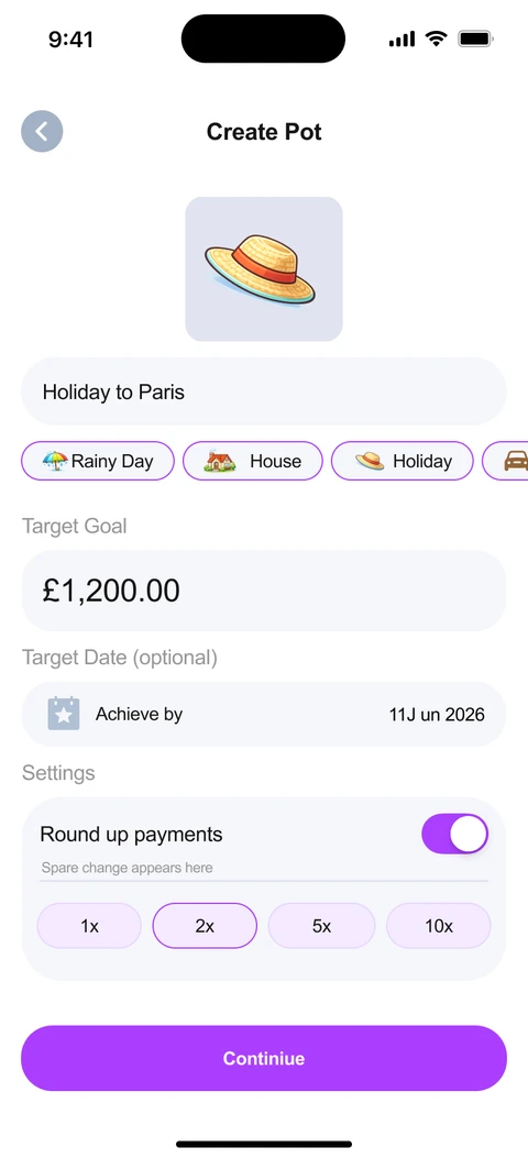
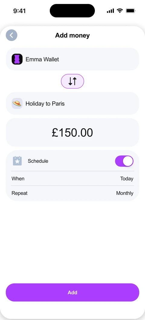
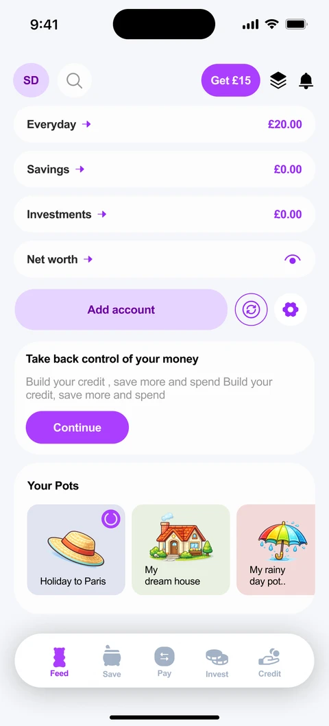
The Brief
Design a Saving Goals feature for Emma that lets users create goals, set target
amounts and dates, and monitor their progress over time.
My Interpretation
People download finance apps with genuine ambitions to save and budget
properly. But in practice, the process is often laborious and full of friction.
Friction in the process
Too many steps, too much complexity. Users abandon before they start
Temptation to dip in
When unexpected costs arise, savings are the first thing people raid
Emotional difficulty
During financial stress, it feels painful to put money aside rather than
spend it
The goal
Remove friction, make saving feel rewarding rather than punishing, and provide
encouragement and positive feedback throughout the experience.
Research & Discovery
I studied savings and budgeting flows across leading finance apps to understand
patterns, friction points, and opportunities.
Apps Studied
Monzo
Revolut
Plum
Chip
Acorns
The KYC Barrier
Banking apps like Monzo and Revolut require KYC (Know Your Customer) verification
upfront, so creating savings pots later is frictionless.
Emma lets users download and use basic budgeting features without KYC. But its
current savings pots all accrue interest, meaning KYC is required at that stage. This
introduces sudden, unexpected friction right when users are motivated to start saving.
Common Patterns
Progress &
Encouragement
Visual progress bars, milestone markers,
and positive feedback showing users how
close they are to their goal
Gamification
Challenges, streaks, and rewards that
make saving more engaging and turn it
into a habit rather than a chore
The Opportunity
Bridge Emma’s low-friction onboarding with meaningful saving features
Zero-Friction
Saving Pots
Non-interest savings
goals that bypass KYC
entirely, users can start
saving the moment they
feel motivated
Progress &
Encouragement
Visual progress tracking,
milestone celebrations,
and positive feedback
that makes saving feel
rewarding
Gamification
& Challenges
Saving streaks,
challenges, and reward
moments that turn
budgeting from a chore
into an engaging habit

Wireframes
Pot creation user flow
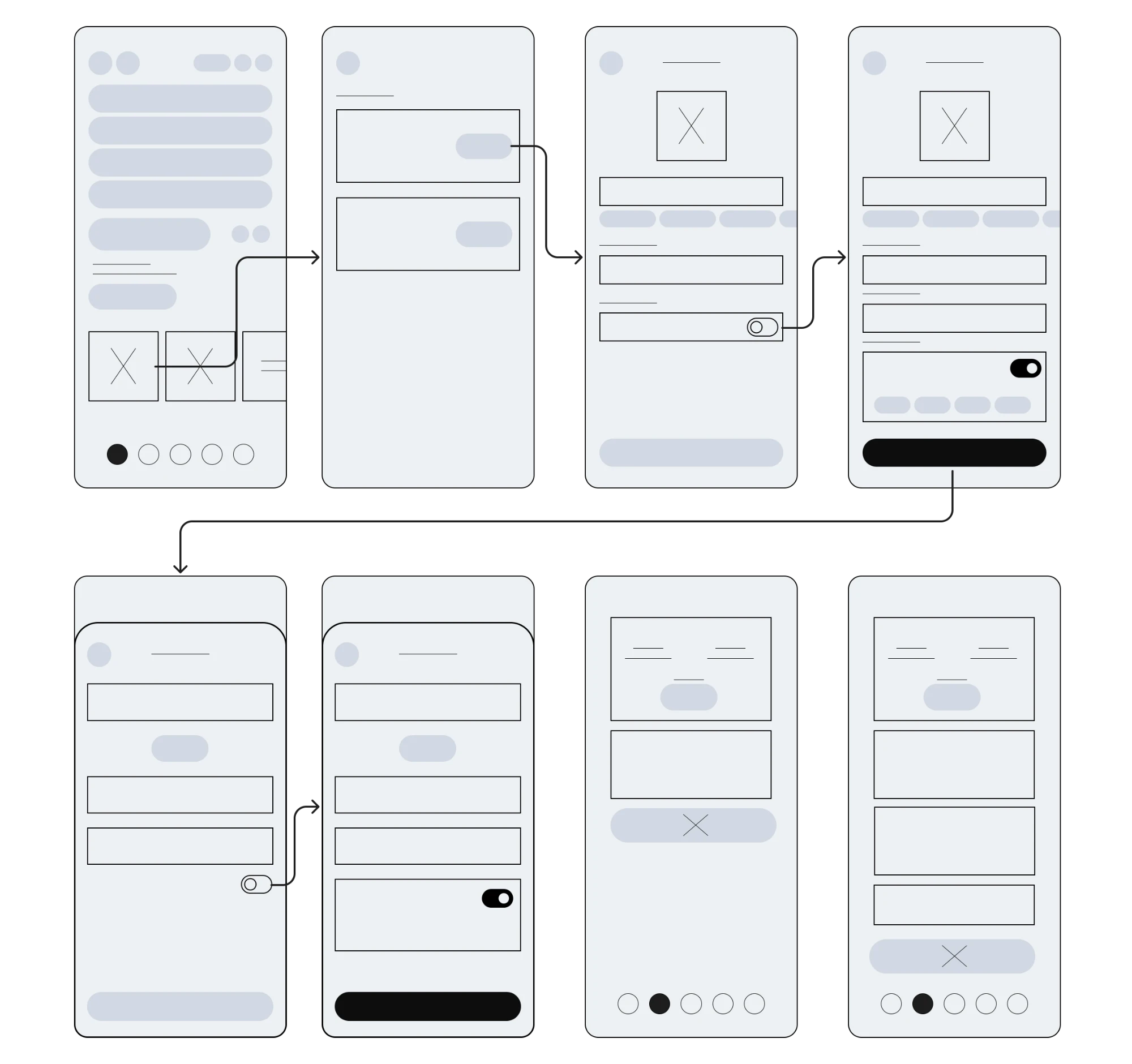
Design Rationale
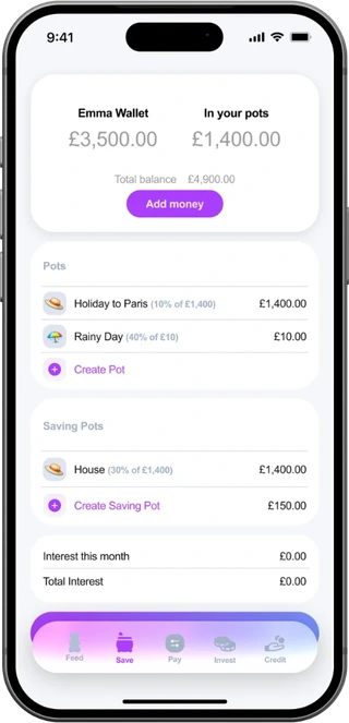
Visual hierarchy: interest-bearing accounts
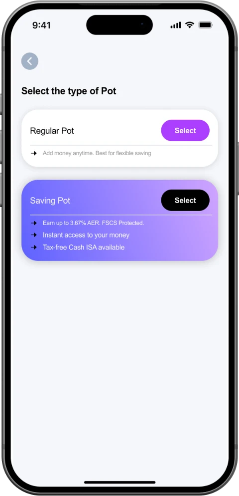
Interest-bearing pots are
given a premium visual
treatment: richer colours,
more prominent placement,
so users intuitively
understand these are the
better option for their money.
Regular pots remain
accessible and clearly
functional, but use a simpler,
more understated visual style
- gently guiding users toward
the interest-bearing option
without hiding the alternative.
Design Rationale
Frictionless pot creation
No KYC required for non-interest pots -
the biggest friction point is eliminated
entirely. Users go from intent to saving
in a single, uninterrupted flow.
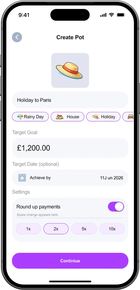
The creation process is stripped back
to the essentials: minimal steps, clear
language, and obvious next actions.
Users can create a pot in seconds, not
minutes.
Design Rationale
A more joyful experience
Playful, cartoonish illustrations are woven
throughout the experience, making screens feel
warm and inviting rather than transactional, and
encouraging users to associate saving with
positive emotions.
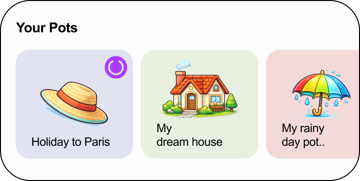

The app proactively detects life events from your transactions,
like travel bookings, new homes, or big purchases, and nudges
you to start saving at exactly the right moment. This turns the
app into a helpful companion rather than a passive tool.

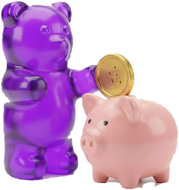
Built-in challenges like The Penny Challenge give users a low-
pressure, playful way to build saving habits. Starting small and
building momentum over time, saving feels like a game rather
than a chore.
App Critique
After downloading and using Emma, I identified three specific improvements
that could positively impact both usability and user engagement.
1/ Home Section Button Clarity
The four buttons at the top of the home screen were not visually distinct
- we redesigned them as clearly separated, individual buttons
2/ Unnecessary Toggle in Pot Creation
A toggle to reveal goal amount and date fields added an unnecessary
step - we removed it and surfaced those fields by default
3/ Navigation Bar Modernisation
The nav bar had a traditional Android aesthetic - we redesigned it to
embrace Apple’s iOS glass feel for a more modern, polished look
Improvement 1
Home Section Button Clarity
The Issue
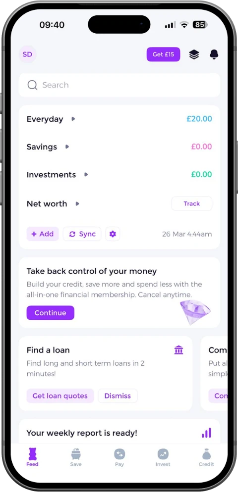
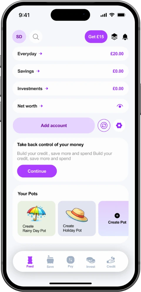
At the top of Emma’s home screen, I feel that the Everyday, Savings, Investments,
and Net Worth buttons are not visually distinct from each other. They blend
together, making it unclear that each one is a separate, tappable button. Users
may not realise they can interact with each individually, reducing discoverability of
key features.
Recommendation
Redesign the four buttons as clearly separated, individually styled elements with
distinct borders, spacing, and visual affordances. This makes each action
immediately recognisable as tappable, improving feature discoverability and
reducing hesitation.
Improvement 2
Unnecessary Toggle in Pot Creation
The Issue
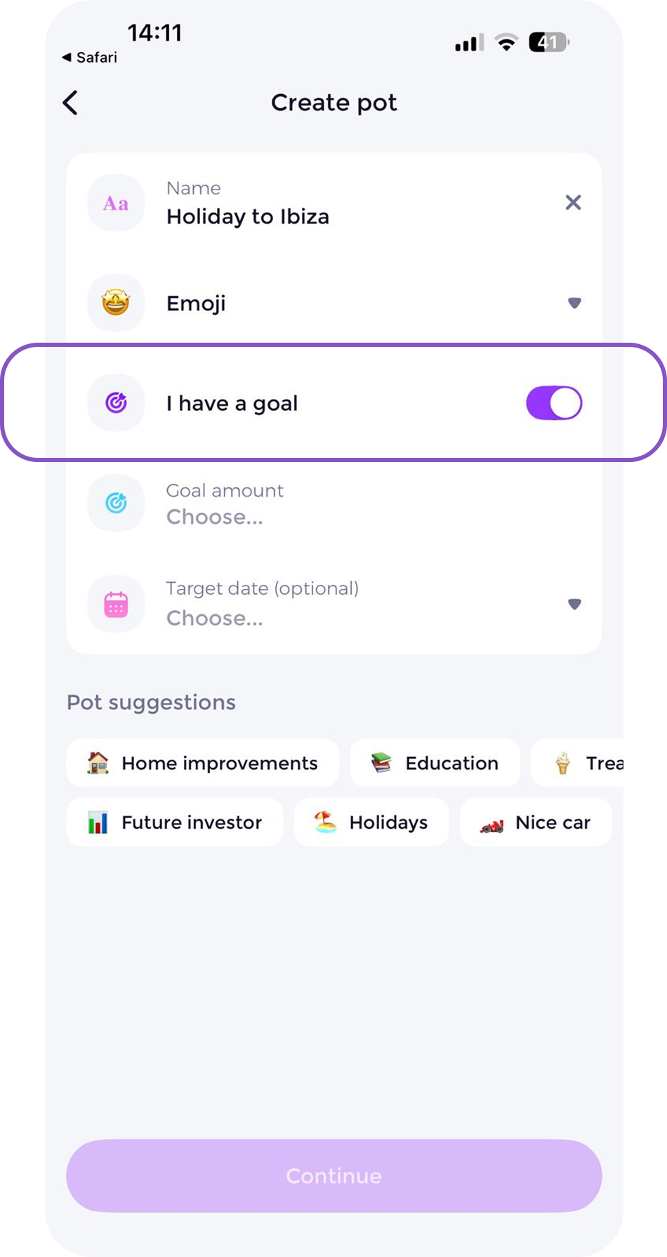
During the pot creation process, there is a toggle that when activated reveals
options to add a target date and goal amount. But this toggle adds an unnecessary
step. The date and amount fields should simply be visible from the start, since they
are core to setting up a saving goal. The toggle creates a moment of confusion
and an extra tap with no real benefit.
Recommendation
Remove the toggle entirely and surface the goal amount and target date fields by
default. This eliminates an unnecessary interaction, reduces cognitive load, and
makes the creation flow feel faster and more intuitive. Every tap removed is friction
removed.
Improvement 3
Navigation Bar Modernisation
The Issue
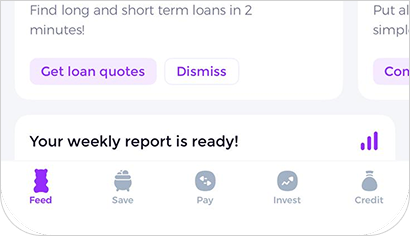
Emma’s current navigation bar has a traditional, Android-style aesthetic that feels
dated on iOS. It doesn’t take advantage of Apple’s modern design language,
particularly the frosted glass translucency and refined material effects introduced
in recent iOS versions. This makes the overall UI feel less premium and less
native to the platform.
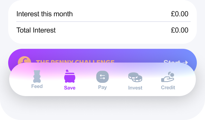
Recommendation
Redesign the navigation bar and overall UI to embrace Apple’s modern iOS design
language, incorporating the glass translucency effect, refined iconography, and
cleaner visual styling. This makes Emma feel native, polished, and contemporary,
meeting user expectations for a premium finance app on iOS.
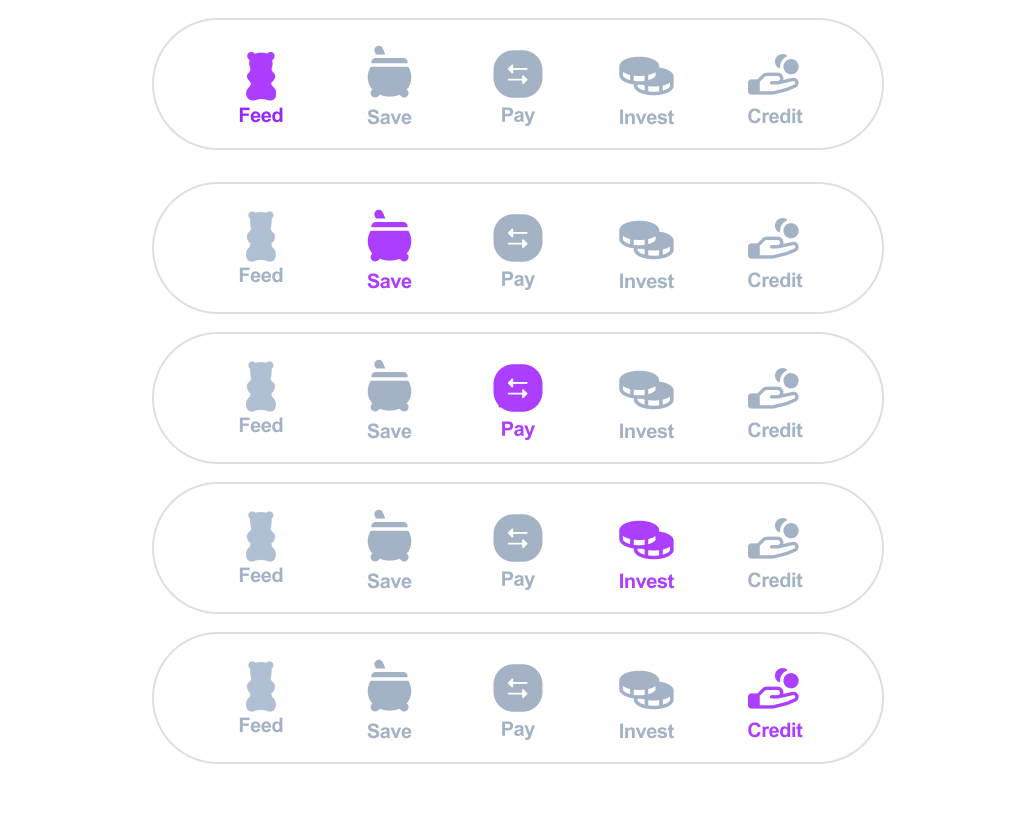
Design System
Navbar: Bottom
Icons
Icons used across this design
were sourced from [Website
Name]. They were selected to
support a clear, friendly, and
consistent visual language
throughout the product.
Font
Arial
Arial is a clean, readable sans-serif font that feels simple, familiar, and
easy to scan, making it a strong choice for a budgeting app.
Arial Regular: Used for clear everyday content like body text and
supporting details.
Arial Bold: Used for emphasis, hierarchy, and important actions.
Typography
Text Font
Typeface
Weight
Size
H1. Headline
Regular
24
H2. Headline
Regular
16
H3. Headline
Bold
14
Navigation
Bold
10
B1. Body
Regular
16
B2. Body
Regular
14
B3. Body
Regular
12
Colors
Black
900
White
0
Neutral
700
Primary
500
300
100
Secondary
700
500
100
Final Designs
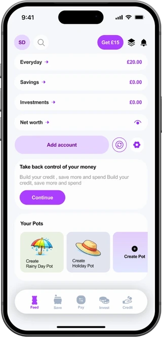
Home
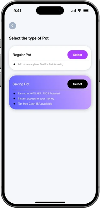
Pot type
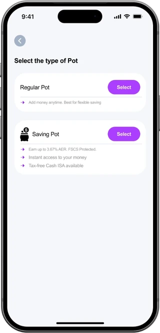
Pot type (alternative)
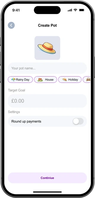
Create pot
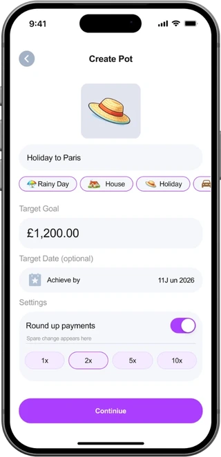
Pot details
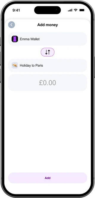
Add money
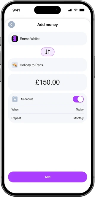
Schedule
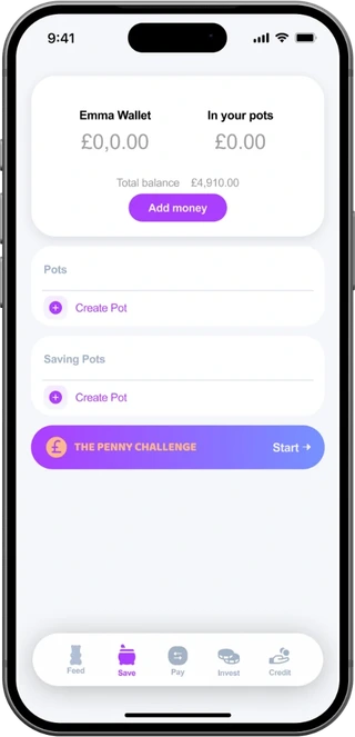
Save
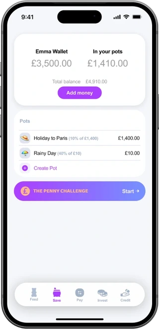
Your pots
Saving pots